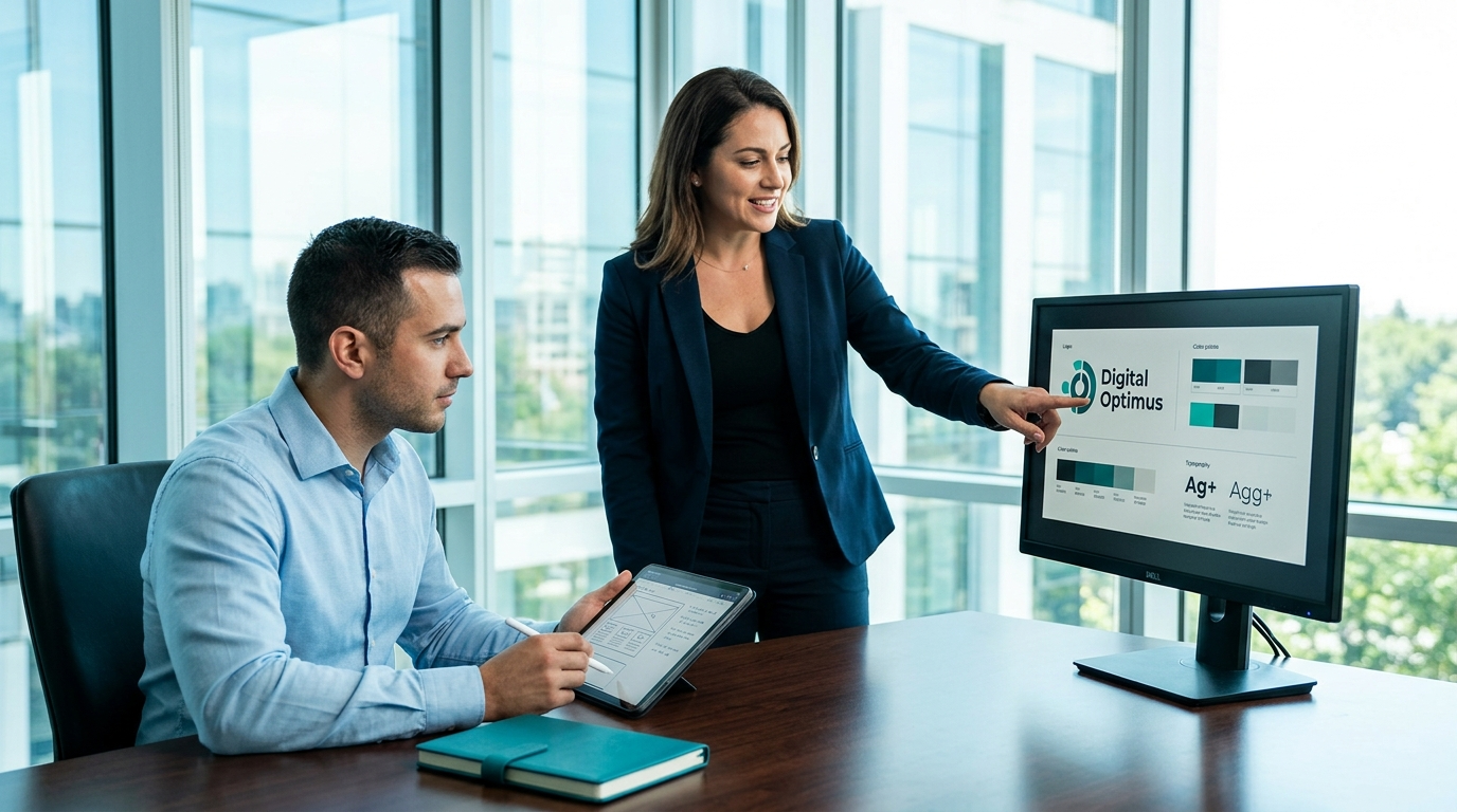
Digital Optimus
Swindon Mobile Responsive Website Design Services
Mobile Responsive Website Design
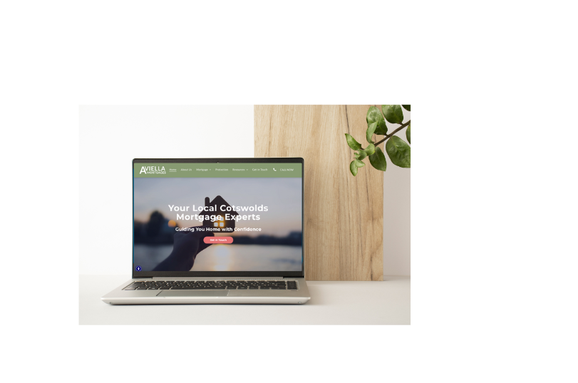
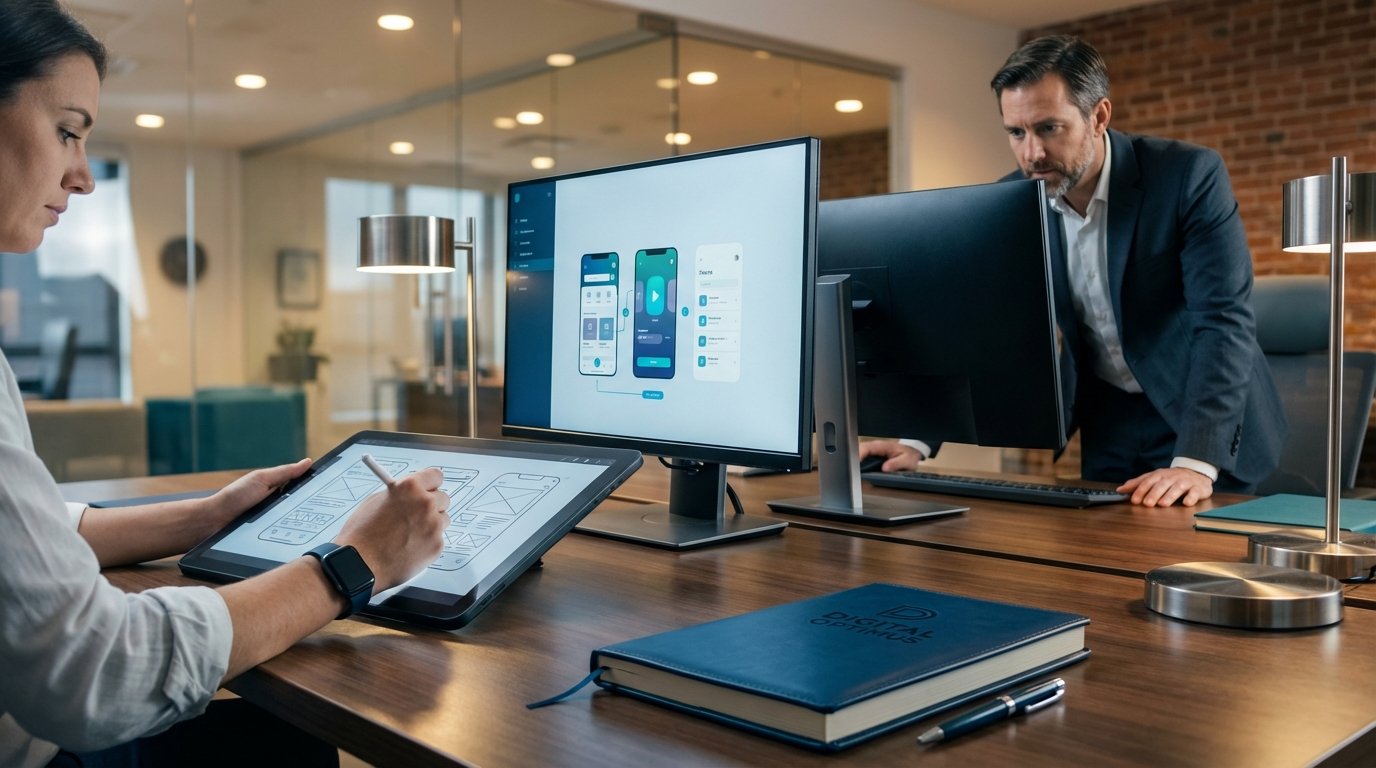
In today’s digital landscape, a strong online presence is essential for any business. Digital Optimus are a leading Swindon website design and build business and single stop digital agency that companies in Swindon and the wider Wiltshire region turn to for a well-crafted website design that can be the difference between being found by potential customers and being overlooked. This blog explores the key ideas behind effective website design, from Digital Optimus, a leading Swindon Website design company. This blog has a focus on mobile responsive website designs that perform on every screen size.
Why Website Design Matters
For businesses in Swindon website design is not just about aesthetics; it’s about user experience, performance, and conversion. A site that looks good on desktop but fails to adapt to mobile devices will lose visitors at the first hurdle. With a growing portion of traffic coming from smartphones and tablets, mobile responsive website designs are no longer optional. They are a strategic necessity for local brands looking to compete effectively, rank well in search engines, and deliver a seamless journey from search to sale.
Key factors include:
- Responsive layout that adapts to all devices
- Fast loading times and performance
- Accessible navigation and clear calls to action
- Local relevance and clear branding
- Search engine friendly structure
Understanding Mobile Responsive Website Designs
Mobile responsive design means the same website automatically reflows its content to fit the viewer’s screen. This approach is different from creating separate mobile and desktop sites. For businesses in Swindon website design that show seamlessly on a desktop or mobile device is important. So many busineseses have a website that has been built on a desktop that works okay on a desktop, but then is slow on a mobile device. Mobile responsiveness translates to:
- Fluid grids that resize images and text without overflowing
- Flexible media that scales to device width
- Media queries that adjust typography and layout rules
- Accessible interactive elements that are easy to tap on small screens
A well-executed mobile responsive website design ensures that visitors have a consistent and efficient experience, whether they’re on a high-end laptop or a modest smartphone.
Core Principles of Effective Web Design
When planning a website design, there are several core principles to keep in mind:
- User-Centric Design
- Start with the user / customer journey. Map out the typical way a visitor to the website might take, from landing on the homepage to completing a contact form or making a purchase.
- Prioritise clarity over cleverness. Simple navigation, legible typography, and a logical content hierarchy reduce friction - always think whats best for the user.
- Mobile-First Approach
- Design for small screens first, then progressively enhance for larger displays.
- Performance and Speed
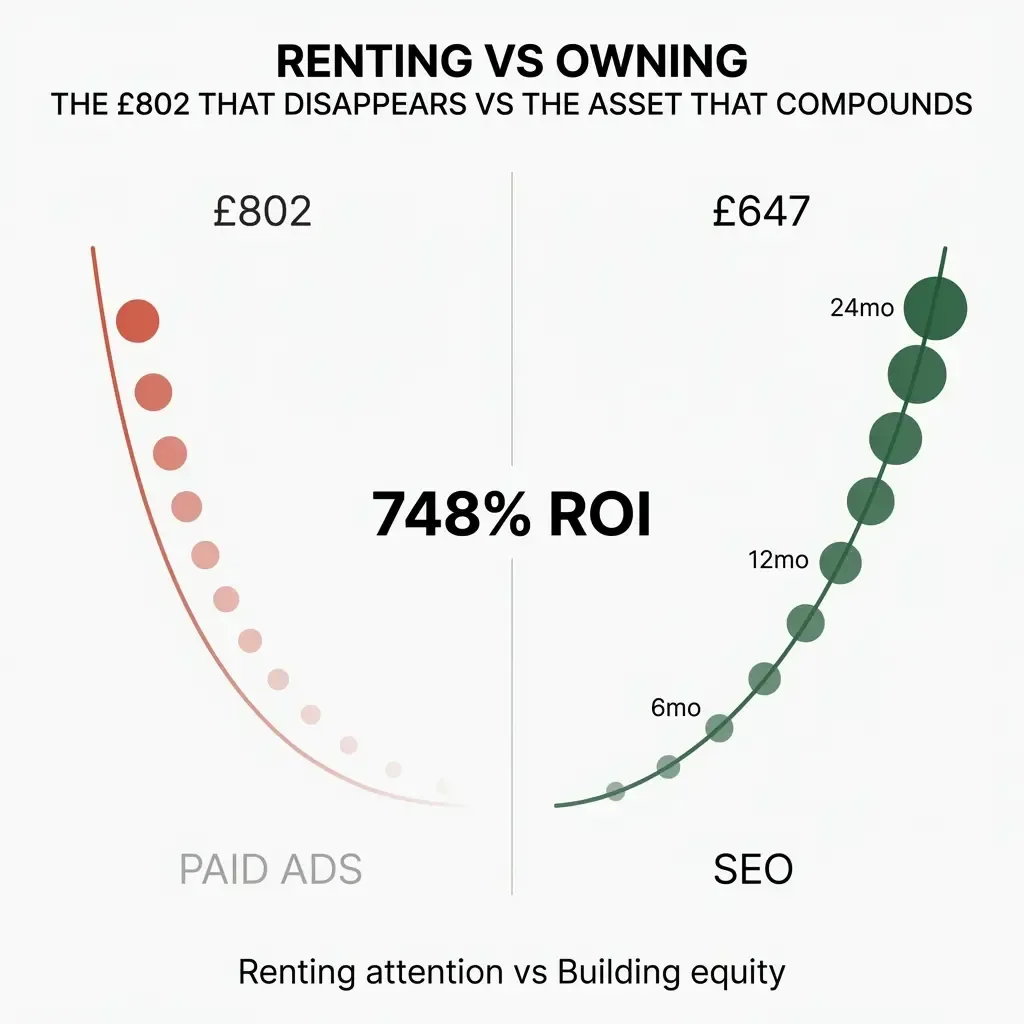
- Speed is key for SEO, optimise images and assets to reduce load times, especially on mobile devices.
- Minimise render-blocking resources and leverage caching where possible.
- Note - fast, efficient websites rank better and convert more potential customers.
- Local Relevance and SEO
- Incorporate local keywords within headings, meta descriptions, and in your content. It is important to remember that whilst key words are important for SEO, your content should be written for the visitor to your website.
- Ensure that your businesses Name, Address and Phone (NAP) is consistent across from your Website, Google Business profile and for local listings.
- Accessibility
- Use semantic HTML, descriptive alt text for images, and proper heading structure.
- Ensure keyboard navigation is smooth and that colour contrast meets accessibility standards.
Mobile First: Why It Should Be Non-Negotiable
In the current market, mobile traffic often surpasses desktop. For swindon website design projects, a mobile-first mindset ensures that critical information is readily accessible on small screens. This includes:
- Prominent contact information and quotes requests
- Clear value propositions above the fold
- Streamlined forms with minimal fields
- Accessible navigation that reduces scrolling and enhances discovery
A mobile-first approach also supports better rankings on search engines, given that mobile-friendliness is a ranking factor.
Case for Localised Web Design in Wiltshire
Wiltshire is a diverse region with towns like Swindon, Salisbury, Marlborough, and Chippenham. A swindon website design solution that acknowledges the local market can tailor content, imagery, and testimonials to reflect real local customers. Localised web design helps in:
- Building trust through regional relevance
- Capturing local search intent with geo-specific content
- Improving conversion by aligning with local customer needs
Final Thoughts: The Value of using a Professional Swindon Website Design Company
For businesses in swindon website design is important to help you stand out from the crowd. Investing in high-quality pays dividends through enhanced user experience, better search visibility, and higher conversions. A mobile responsive website design approach ensures your brand remains accessible and competitive across devices. By prioritising mobile-first principles, local relevance, and performance, businesses in Swindon and the broader Wiltshire region can create websites that not only look great but also drive measurable business outcomes.
If you’re exploring options for a new or rebuild of a website design, consider partnering with designers who understand the local market, prioritise accessibility, and deliver scalable, responsive solutions. Your next website should be a strategic asset that grows with your business and meets the expectations of today’s digitally connected audience. Digital Optimus based in Swindon build and design SEO Optimised websites that work as hard as your business does.


